Hello AppArmor nation! Everyone here is hoping that you and yours had a wonderful Easter long weekend!
Today we’ve got a quick and exciting new capability to tell you about: Image Buttons. In the past, images were used vary scarcely on the platform. This was for a number of reasons but we mostly felt that these kinds of options weren’t really required for a safety app to be successful. The early trend in mobile apps was to avoid images, so we did just that. In fact, Image Buttons aren’t for every app, but we do think it could be something valuable (and free!) to add to your apps.
Here’s the deal: images can now function just like a normal button on the platform. This means that you can have a menu (e.g. Emergency Contacts, Report a Tip, etc) beneath an image, rather than a button (or “tile”). In essence, you can now use stunning images of your campus / your security or police force to provide a very different aesthetic appeal. Or alternatively, you could design some of your own “buttons” that are really just images (rather than something from the icon picker in the Designer). Check out the photos of the uRochester app (UR Mobile) and some concept art for other apps below:
Obviously having a modern looking app is important to getting downloads. For those of you who have had apps for years on our platform, this could be a good opportunity to “refresh” the app’s visual identity. Regardless, students will likely respond well to these kinds of aesthetics.
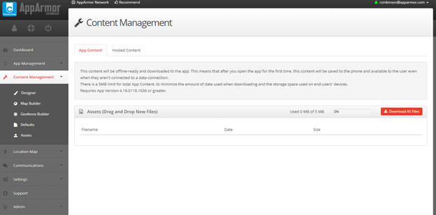
The other important innovation here is the addition of the “Asset Management” page in the dashboard. It’s here that you can upload your own images, and have them stored locally in the app (note: there is a limit of 5MBs for local content, as we don’t want your app to get too “heavy”). Once you’ve added your images to the assets page, you can add them into the app via the designer. Below is a screenshot of that page:

For the first image or two, we suggest reaching out to our team at support@apparmor.com who can give you a quick tutorial on how to manage these images yourself. It’s simple to use and there are some easy rules to follow to ensure your app looks sharp. Your mobile app might also require an appstore update to enable this feature. Our support team can let you know if that’s necessary.
This might seem like a subtle improvement that doesn’t necessarily directly involve the safety of end users. However, we all know that getting downloads for your app is a constant project; you really can’t take a year off of marketing your app. As such, image buttons can provide an effective way to sharpen the look of your app and drive more end user engagement.
Have other suggestions for new app design elements? Let us know in the comments below or by emailing us at support@apparmor.com
Until next time,